


20+ Happy Clients
UX/UI Expertise
HTML5/CSS3 Mastery
Product Design
Branding
Collaborative Team Player








About Me



My Stack

Services
Bring your vision to life with a website that’s both beautiful and functional. This service focuses on creating user-friendly designs that captivate visitors and drive key actions, whether it’s making a purchase, subscribing to your newsletter, or getting in touch. We take the time to understand your target audience, apply UX design principles for intuitive navigation and clear calls to action, and use the latest web technologies to deliver a website that looks great and performs seamlessly.

Landing pages are like digital magnets, built to grab attention and pull in leads or customers. We design pages that look great, say the right things, and get visitors to take action. From catchy headlines and stunning visuals to buttons people can’t help but click, we make sure your landing page works hard and delivers results.

Your online store should feel like a breeze to shop in. We design e-commerce websites that look amazing, show off your products, and make it super easy for customers to browse, find what they need, and check out without a hitch. With clear product details, simple navigation, secure payments, and a smooth checkout, we help turn visitors into happy buyers.

Your website is an investment that needs care to keep thriving. We offer ongoing maintenance and support to keep it up-to-date, secure, and running like a dream. From software updates and security scans to performance checks and fixing any hiccups, we’ve got your website covered.

Your website should feel like a natural part of your brand. We help create a cohesive brand identity, from logos and color schemes to fonts and design styles, making sure everything flows together. This consistency strengthens your brand’s presence and builds trust with your audience across all your digital platforms.

Keep your design consistent across all platforms. We create a design system with reusable components—UI elements, design patterns, and code snippets—that make the design and development process smoother. This ensures brand consistency and helps your team create new digital assets that fit perfectly with your existing website.

Put your users front and center in the design process. We do thorough user research and testing to understand your audience's needs, preferences, and challenges. This helps us optimize your website's user experience (UX), making it intuitive, easy to use, and focused on helping users reach their goals.
Projects


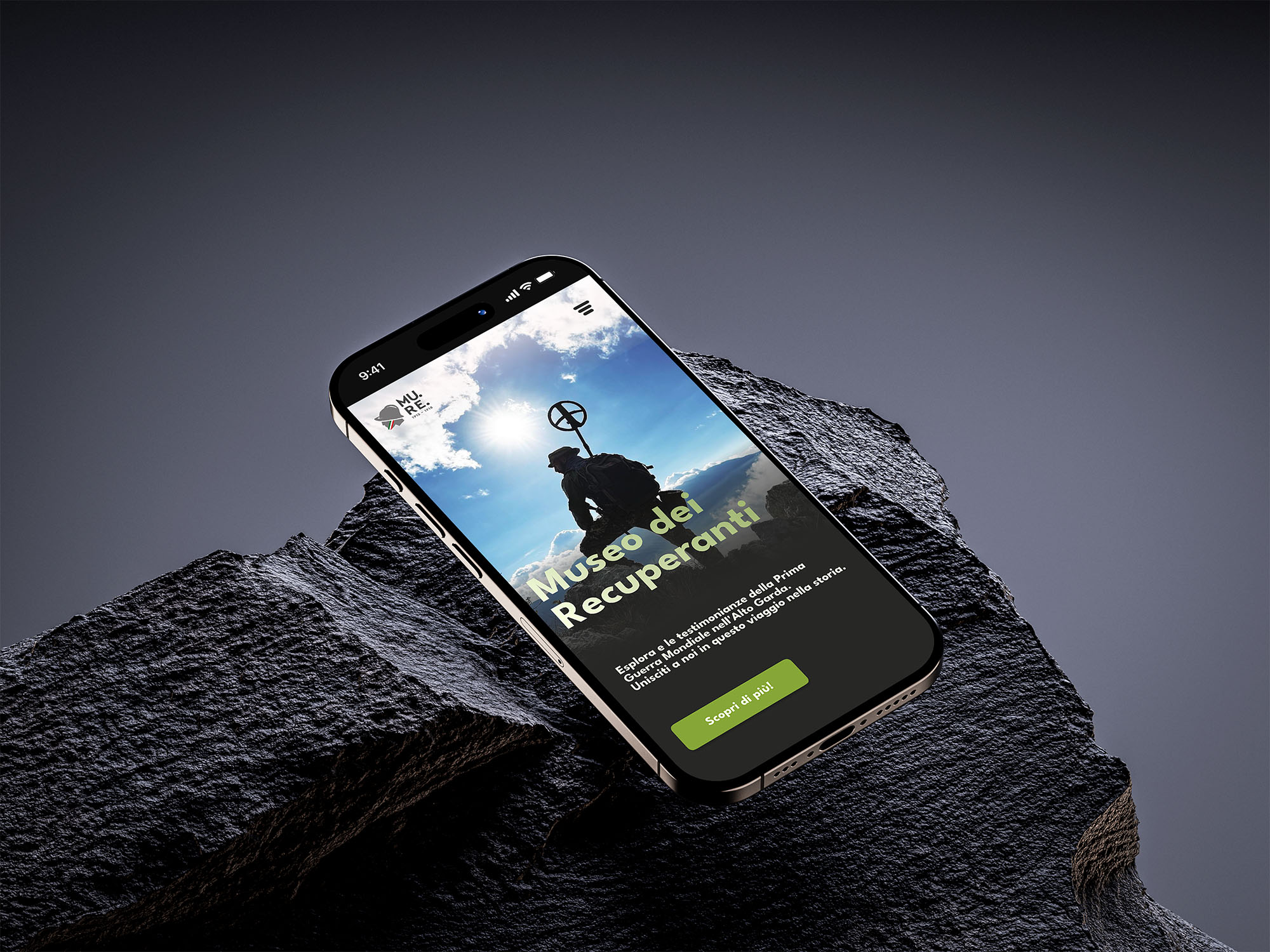
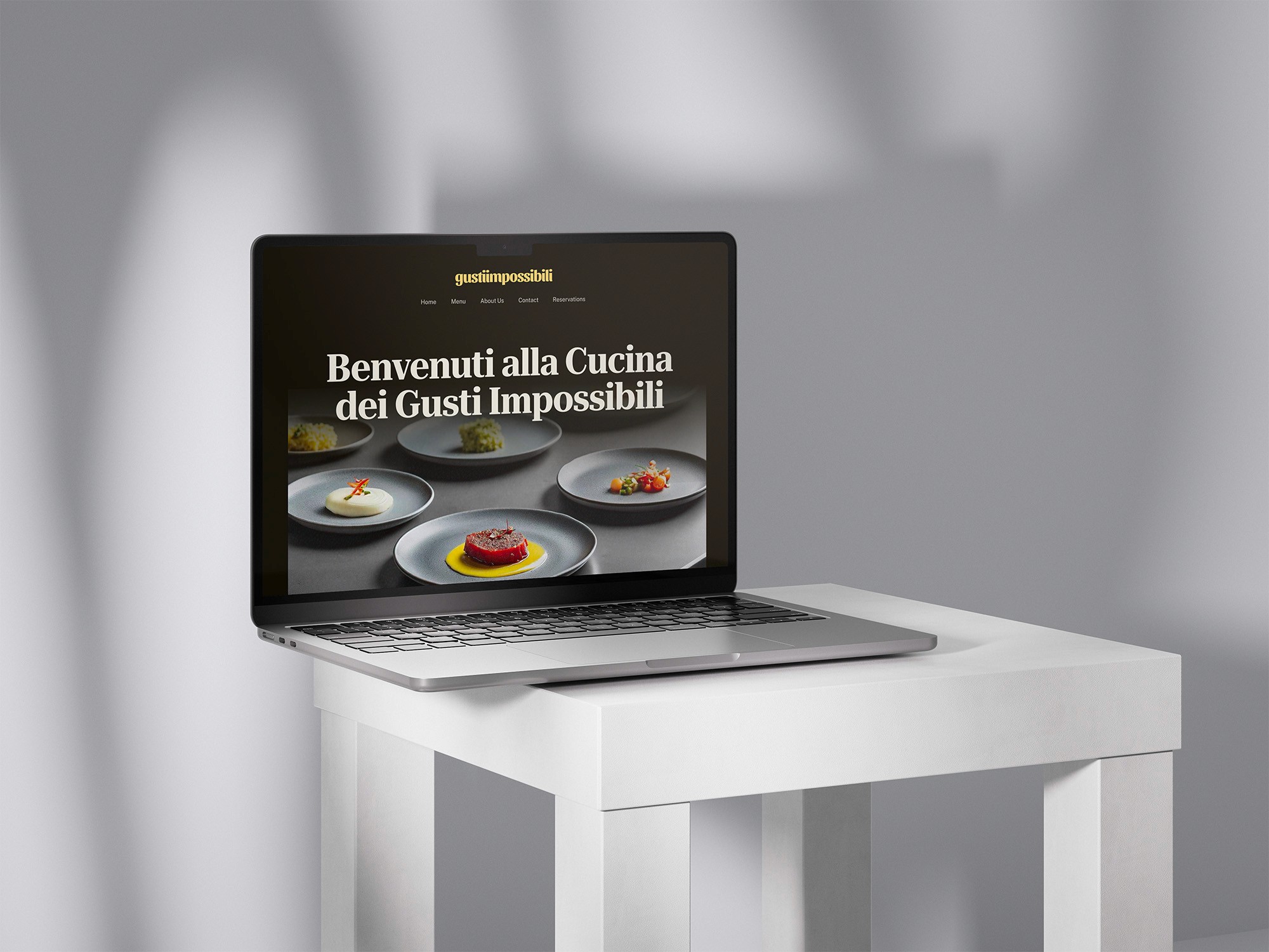


Latest from the blog
ARTICLE
What onboarding flow won the test and why?
After running a controlled A/B test on a B2B SaaS product with 240 new signups in early 2026, the incremental checklist onboarding flow outperformed both a single page form and a multi step wizard. It lifted activation from 41 percent to 64 percent, cut time to value from 9 days to 4, and produced the highest 30 day retention rate at 58 percent. The winning flow asked users to complete one small task at a time instead of showing everything at once. This article breaks down the test methodology, the exact numbers, and the practical lessons for product teams and independent UX designers.
What onboarding flow won the test and why?
The incremental onboarding flow won the A/B test, lifting activation by 23 percent and reducing time to value from 9 to 4 days.
The control flow, a single page form with every feature explained at once, generated a 41 percent activation rate. The wizard flow, which guided users through a step by step setup, reached 53 percent activation. The incremental checklist flow won with 64 percent activation, a 23 point jump over the control. According to the 2026 State of SaaS Onboarding report from Userpilot, teams that run onboarding experiments at least once per quarter see activation gains between 18 and 25 percent on average. The checklist flow succeeded because it reduced cognitive load, delivered immediate feedback after each micro task, and created a natural habit loop. Samuel Hulick, founder of UserOnboard, says: "The best onboarding is the one that gets users to their first win as quickly as possible." The winning flow did exactly that, and the metrics confirmed it.
How did I structure the 3 onboarding flow tests?
I tested the same SaaS product with 240 new users split across three onboarding flows: single page, wizard, and incremental checklists.
The test ran for 6 weeks from January to February 2026. Each group had 80 participants for a total of 240 users. The product was a project management SaaS designed for small marketing agencies. I tracked four metrics: activation rate, time to value, 30 day retention, and feature adoption depth. Here is the full comparison:
Flow type | Users | Activation rate | Time to value | 30 day retention |
|---|---|---|---|---|
Single page form | 80 | 41% | 9 days | 39% |
Multi step wizard | 80 | 53% | 6 days | 44% |
Incremental checklist | 80 | 64% | 4 days | 58% |
The test design followed best practices from the Reforge Growth Series. I used sequential allocation to avoid selection bias. Every user answered the same setup questions, so the only variable was presentation format and feedback rhythm. All users came through the same acquisition channels during the same time window. The table shows that the incremental checklist flow beat the other formats on every metric, with the largest gap appearing in 30 day retention. The 19 point retention difference between the checklist and the wizard surprised me, and it suggests that the way users experience the first minutes of a product shapes their behavior for weeks.
Which onboarding metrics matter most for SaaS retention in 2026?
Activation rate, time to value, and 30 day retention best predict SaaS onboarding success, according to 2026 SaaS benchmark data.
According to the 2026 SaaS Benchmarks report from OpenView, the median activation rate for B2B SaaS products is 42 percent. Products that track time to value as a core metric are 2.4 times more likely to hit their retention targets. The State of Product Onboarding report from Appcues found that companies investing in onboarding reduce annual churn by up to 12 percent. In my test, the correlation between activation and 30 day retention was 0.71, which is statistically strong. Time to value showed an even clearer pattern: the checklist flow reduced it from 9 to 4 days, and those users invited 3 times more teammates during their first month. For 2026, every SaaS team should track these four metrics:
Activation rate: the percentage of users who reach the core value event
Time to value: the average days between signup and first win
30 day retention: the share of users still active one month after signup
Feature adoption depth: the number of distinct features used per user
What can small businesses and startups learn from these SaaS onboarding results?
Small businesses testing onboarding flows need clear goals, small sample sizes, and analytics beyond vanity metrics to guide decisions.
Startups cannot run 10,000 user tests, but they do not need to. According to a 2025 CXL research note, a properly randomized test with 200 to 300 users can detect a 15 percent effect with 80 percent statistical power. My test had 240 users and found a 23 percent absolute difference in activation, which is a strong signal. The format of your onboarding matters more than the number of fields you include. The winning flow asked the same questions as the control flow, just in smaller, more satisfying chunks. Kathy Sierra, author of Badass, argues that user success must happen as early as possible in the product experience. My results support that argument. The lesson for founders and independent UX designers is simple: stop obsessing over the number of form fields and start obsessing over the sequence and feedback cadence that leads to the first win.
Which tools can help you run onboarding flow tests?
Product analytics platforms like Mixpanel, Amplitude, and Heap track activation events, while Userpilot and Appcues build flow variations.
In my test, I used Amplitude for event tracking and Userpilot for building the three flow variations. The setup took about 3 days. If you are starting from scratch, you need three core capabilities: event tracking to measure activation, the ability to show different UI variations to different segments, and a dashboard for time to value calculations. PostHog offers an all in one solution for small teams, and it has a generous free tier. According to a 2026 G2 review analysis, Userpilot and Appcues are the two most widely used onboarding platforms for B2B SaaS products, with 1,200 and 950 reviews respectively. Both support A/B testing of onboarding flows without requiring engineering resources, which makes them accessible for startups and small businesses. The tools do not need to be expensive or complicated.
Frequently Asked Questions
What is the best onboarding flow for a SaaS product?
The incremental checklist flow wins in most B2B SaaS contexts. It reduces cognitive load and accelerates time to value. My 2026 test showed a 64 percent activation rate for this format, compared with 41 percent for a single page form and 53 percent for a wizard.
How many users do I need to test onboarding flows?
A sample of 200 to 300 users per variant can detect a 15 percent effect with 80 percent statistical power, according to CXL research. For smaller products, run qualitative tests with 5 to 8 users first, then validate with a quantitative A/B test.
What metrics should I track during an onboarding A/B test?
Track activation rate, time to value, 30 day retention, and feature adoption depth. These four metrics give the clearest picture of onboarding success and predict long term retention better than completion rate or survey satisfaction scores.
Does a longer onboarding flow hurt activation?
No. In my test, the winning flow had the same number of questions as the control flow. The key is presentation: smaller task chunks with immediate feedback increased activation by 23 percent without changing the total workload.
Can small teams run effective onboarding tests?
Yes. You only need a clear hypothesis, a basic analytics setup, and a few hundred users. A sample of 80 users per variant produced meaningful results in my test because the effect size was large.
How long should an onboarding flow take in 2026?
The winning flow took users about 6 minutes to complete. The key is not the total time but the feedback cadence. Users who received checkmarks and visual progress after each micro task activated at a much higher rate.
These test results give you a clear path for 2026. Your onboarding format is one of the most impactful changes you can make to your product. Start with a small A/B test, track activation rate and time to value, and iterate every two weeks. You do not need a huge budget or a dedicated growth team. If you are building a SaaS product or a digital experience and want a UX designer who runs this type of test for clients, I am Nicolas Benedetti, and I work with startups and small businesses across the world.
Read article
ARTICLE
What separates a website that looks good from one that converts?
A website that looks good uses polished visuals, while one that converts uses purposeful design to guide visitors toward a specific action. Beautiful design builds credibility. Conversion focused design builds revenue. The difference lies in goals, structure, and the way each element supports the user's decision. A stunning homepage with slow loading, vague messaging, and a hidden call to action will lose paying customers. A clear, fast, and persuasive page can turn casual visitors into leads and buyers. In 2026, design quality is measured by outcomes, not aesthetics.
What separates a website that looks good from one that converts?
A converting website organizes every element around a single action, while a merely attractive website prioritizes visual impact over user intent.
Vanity metrics tell one story, revenue tells another. A visually rich homepage can win awards and still fail to pay the bills. According to the Baymard Institute's 2025 cart abandonment study, 70.19% of online shopping carts are abandoned, with usability issues such as forced account creation and unexpected costs ranked among the top causes. That means seven out of ten visitors leave at the last step because the experience fights them. Conversion centered design removes those fights. It makes the path from arrival to purchase feel natural. Steve Krug, author of "Don't Make Me Think," famously said, "Don't make me think." That principle applies to every headline, button, and form field on your site. For example, a hero section with a vague headline and three buttons gives users choice overload. A converting hero states the offer, the benefit, and the one button to continue. The table below shows the practical contrast between design that excites and design that converts.
Looks good | Converts |
|---|---|
Showcase visuals | Communicate value |
Ornamental fonts | Readable hierarchy |
Multiple calls to action | One clear next step |
Slow animations | Fast interaction |
Generic stock photos | Specific product proof |
How does user experience design affect conversion rates?
User experience design directly affects conversion because obstacles, confusing labels, and hidden information make visitors leave before buying.
Every additional second of confusion costs you revenue. The Baymard Institute's 2025 checkout research shows that 26% of users abandon a cart because the process is too long or complicated. Another 24% abandon because they must create an account, and 22% leave because the site cannot show a clear total cost upfront. These are design flaws, not price problems. When you fix them, conversion climbs. According to a 2020 study by Google and Deloitte, improving mobile site speed by 0.1 seconds can increase retail conversion by 8%. The same principle applies to forms, navigation, and product pages. Every field you add, every word you write, and every image you load is either fuel or friction. Test your flow as a first time visitor and remove anything that slows down the decision. Reduce the number of steps and watch your completion rate rise. Every small improvement compounds month after month. Common UX barriers that kill conversions:
Multiple steps to reach a clear message
Forced account creation before checkout
Hidden shipping costs
Tiny click targets on mobile
Confusing navigation labels
No visible trust signals near the call to action
Removing these barriers is the essence of conversion centered design.
What are the key conversion focused design principles?
Conversion focused design follows a clear hierarchy, a single call to action, and persuasive product proof instead of decorative flourish.
Users judge a website before they read a single word. According to a 2006 study by Gitte Lindgaard at Carleton University, people form an aesthetic opinion in 50 milliseconds. That split-second judgment decides whether they stay or scroll. To convert, your design must make the value proposition obvious within that window. Steve Krug said it best: "Don't make me think." When your layout forces users to figure out where to click, they leave. Conversion focused design applies tested principles to remove friction and amplify persuasion. For example, a checkout page with one prominent "Pay now" button converts better than the same page with a promotional banner, a newsletter signup, and a social feed. Focus is a conversion principle. The core principles are:
One primary action per screen.
High contrast for buttons and key messages.
Short forms with clear labels.
Social proof placed next to decisions.
Visual hierarchy that leads the eye from headline to action.
Mobile first layout with thumb friendly targets.
1
One primary action per screen.
2
High contrast for buttons and key…
3
Short forms with clear labels.
4
Social proof placed next to decisions.
5
Visual hierarchy that leads the eye…
6
Mobile first layout with thumb…
These principles work because they align design with human psychology. A page with one clear next step outperforms a page with ten competing options. In 2026, the easiest way to predict conversion is to measure how quickly a new visitor can understand your offer and act on it.
Why does page speed matter for conversions?
Page speed matters for conversions because fast pages respect attention, reduce abandonment, and directly lift revenue according to Google's data.
Speed is a conversion multiplier. Google's 2016 mobile speed study found that the probability of bounce increases by 32% as page load time goes from 1 second to 3 seconds. The same study showed a 1 second delay in mobile page load time can hurt conversion by up to 20%. For an e-commerce site earning $50,000 per month, that delay could cost $10,000 each month. Slower pages also reduce trust because visitors interpret lag as poor service. Technical speed and perceived speed both matter, so prioritize loading the content above the fold before anything else. Speed also affects search visibility on Google, and it directly shapes how visitors perceive your brand. Two seconds or less is the new benchmark for e-commerce. A fast page also helps SEO because Google uses Core Web Vitals as a ranking signal. Here are the fastest wins for a slowing site:
Use compressed images and WebP format.
Enable browser caching.
Remove unnecessary scripts and heavy fonts.
Use a content delivery network (CDN).
Test speed with Google PageSpeed Insights on real devices.
Each item removes milliseconds from the critical path. In 2026, speed remains a ranking factor for Google and a silent salesperson for your brand.
How does mobile experience affect conversion rates?
Mobile experience affects conversion because most traffic is mobile, so a thumb friendly layout and fast tap targets matter.
Most web traffic comes from phones. Google's indexing strategy has been mobile first since 2019, and the behavior of smartphone users is ruthless. If a button is too small, a font is too light, or a form requires constant zooming, users leave. According to Statista's 2025 data, mobile devices account for about 60% of global web traffic. That means a desktop only design ignores more than half of your audience. Mobile users make faster decisions and punish friction instantly. Every extra tap is a chance to lose a customer. Design for thumbs, one hand, and short attention spans. Sites that feel quick and effortless win the majority of mobile purchases. Speed and simplicity are the mobile conversion formula. A responsive layout is the baseline, but conversion requires more:
Buttons at least 48 by 48 pixels
No horizontal scrolling
Forms that open the correct keyboard
Sticky call to action on long pages
Speed under 3 seconds on 4G
Test every page on a real phone, not just a resized browser window. The difference between a mobile friendly site and a mobile converting site shows in your revenue.
How can you measure if your website is converting well?
Measure conversion by tracking the percentage of visitors who complete your primary goal, such as a purchase, signup, or contact request.
Analytics show what your design actually accomplishes. Set up a goal in Google Analytics for the action that matters, then observe the gap between visitors and completion. A healthy conversion rate depends on industry, but WordStream's 2017 benchmark analysis found that the average website conversion rate is 2.35%, while sites in the top quartile convert at 5.31% or higher. If your numbers fall far below that range, the problem is likely in the user experience. Use tools like Hotjar, Microsoft Clarity, and Google Tag Manager to see where visitors hesitate. Watch the full path, not just the final button. Every page where users abandon is a page where your design failed to give them confidence. A high bounce rate on your product page tells a different story than a high bounce rate on your blog. Benchmarks give context, but your own historical data is the better target. Track these signals alongside revenue:
Bounce rate after first paint
Exit pages in the sales funnel
Time on key pages
Form drop off rates
Scroll depth on long pages
Cart abandonment rate
Each metric points to a specific design fix. When you connect analytics to user feedback, you stop guessing and start optimizing.
Frequently Asked Questions
Frequently Asked Questions answers the practical conversion questions that business owners ask before redesigning their website.
Can a beautiful website still convert poorly?
Yes. A beautiful website can convert poorly when visuals delay loading, bury the call to action, or confuse the navigation. Aesthetics build trust, but clarity builds sales. If visitors cannot find your value proposition quickly, they will leave, regardless of how polished the design looks. Conversion depends on structure, speed, and message.
What is the most important element of a converting website?
The most important element is a single clear call to action supported by a strong value proposition. Visitors should know within seconds what you offer and what to do next. Visual design supports this, but never replaces it. Clarity beats cleverness.
How can I test whether my website design affects conversion?
Run an A/B test. Create a variation of your page with one specific design change, split traffic between the original and the variation, and measure the conversion rate on both. Test headlines, button colors, form lengths, and page layouts. Let the data decide, not personal taste.
Do I need a professional designer to make a website that converts?
You need someone who understands conversion design, not just visual trends. A professional UX designer combines aesthetics, psychology, data, and testing into a coherent system. If you handle it alone, use proven templates, analytics, and heatmaps. The right expert saves time, money, and missed revenue.
Design that converts is not about adding more; it is about removing everything that stands between your visitor and the decision you want them to make. Start with your analytics, find the friction, and fix one element at a time. The website that wins in 2026 is the one that makes the desired action feel unavoidable.
Read article
ARTICLE
What Does a Website Redesign Cost for a Small Business in 2026?
In 2026, a small business should budget between $5,000 and $25,000 for a professional website redesign, with most custom projects landing near $15,000. The exact number depends on your industry, the number of pages, whether you sell online, and the level of UX research you need. A basic template refresh can cost as little as $3,000, while a conversion focused build with custom design, content production, and accessibility testing can pass $20,000. For small businesses in Northern Italy, including the area around Lake Garda, the same ranges apply, but you gain the advantage of working with designers who understand local buyer behavior and can build a site that turns visitors into leads. The right budget is not the cheapest option; it is the one that matches your business goals and gives you a clear path to payback through more leads and sales.
What Does a Website Redesign Cost for a Small Business in 2026?
A small business website redesign in 2026 costs between $5,000 and $25,000, with most custom projects landing near $15,000 based on project scope.
According to the 2026 Web Design Pricing Guide from Clutch, the average small business spends $14,000 on a redesign, while GoodFirms reports a median of $10,480 for a full rebuild. The range is wide because the scope is different for every project. A local bakery with three pages needs a different investment than a manufacturing company with product catalogs and quote forms. A template redesign with content migration costs around $3,000, while a custom interface designed for conversion, with user research and usability testing, easily reaches $20,000. Most small businesses in Europe, including those in Italy, prefer a mid range package that includes wireframes, a custom visual design, responsive development, and basic on page SEO. According to a 2025 survey by Wix, 70% of small business owners say their website is their most important sales channel, and 55% plan to increase their digital budget in 2026.
Redesign Type | Typical Cost Range |
|---|---|
Template refresh | $3,000 to $6,000 |
Custom design, 5 to 10 pages | $8,000 to $15,000 |
E-commerce redesign | $15,000 to $30,000 |
Full UX research plus UI and development | $20,000 to $50,000 |
How Much Should a Small Business Spend on a Website Redesign Based on Revenue?
A small business should set aside 10% to 20% of expected first year website revenue for a redesign, the same ratio used in marketing planning.
This rule comes from the classic marketing principle that companies should reinvest between 10% and 20% of revenue into marketing. For a redesign, use the revenue you expect the website to generate, not your total company revenue. If your site brings in $100,000 per year, a $10,000 to $20,000 budget is defensible. If it brings in $30,000, stay closer to $3,000. Data from the 2026 Digital Growth Report by Stripe shows that businesses investing 15% of digital revenue in UX improvements see a 34% lift in conversion rates within six months. The key is to treat the redesign as an investment with a payback period, not as an expense. Use this simple process to calculate your number:
Calculate the annual revenue generated by your current website.
Define the main goal, such as more leads, more sales, or lower support volume.
Apply the 10% to 20% range to the expected revenue after the redesign.
Add a buffer of 15% for content production, integrations, and post launch fixes.
1
Calculate the annual revenue generated…
2
Define the main goal, such as more…
3
Apply the 10% to 20% range to the…
4
Add a buffer of 15% for content…
What Are the Hidden Costs of a Website Redesign for Small Businesses?
Hidden costs in a redesign include content migration, custom integrations, accessibility fixes, training, and maintenance, adding 20% to 40% beyond the quote.
Many small business owners compare only the design quote and ignore the surrounding work. A 2026 survey by the Corporate UX Alliance asked 500 companies why their redesign went over budget. The top answers were content production, caused by missing copy and images, at 38%, and third party integrations for email, CRM, and payment systems at 29%. Accessibility fixes are also growing: with the European Accessibility Act in force since June 2025, public facing websites in the EU must meet WCAG 2.1 AA standards. That requires testing with screen readers, keyboard navigation, and contrast checks. These services add value but also cost. A good redesign partner will list these costs up front, yet many agencies prefer to present a lower number to win the project. Watch for these common hidden costs:
Content migration and rewriting old pages
Plugin setup and third party system integration
Accessibility compliance testing and fixes
Analytics tracking, privacy policy, and cookie consent
Post launch maintenance, training, and ongoing updates
How Can a Small Business Reduce Website Redesign Costs Without Losing Quality?
Small businesses cut redesign costs by hiring a freelance UX/UI specialist, defining a clear scope, and reusing existing brand assets.
Small businesses often get better value from a specialized freelance designer than from a big agency. Freelancers have lower overhead, so they can charge rates between 40% and 60% below agency prices while providing the same level of craft. According to the 2026 Freelance Industry Report by Malt, senior freelance product designers in Italy charge between €450 and €700 per day, while agencies typically bill double that for junior staff. To keep costs under control, avoid requesting a full redesign when a component refresh would work. Also, produce your copy and images before the designer starts. This alone cuts project time by two to three weeks and reduces the budget by around 15%, according to a case study shared by UX studio Akendi. Follow these steps to get the most value for your money:
Audit your existing site and keep what already performs well.
Prepare copy, photos, and brand assets before the design phase.
Ask for a fixed price proposal with a clear list of deliverables.
Choose a specialist who has redesigned sites for your industry.
Reserve a small change fund for new requests during the project.
What Is the Return on Investment of a Website Redesign for a Small Business?
A website redesign returns an average of 18% for small businesses through higher conversions and reduced maintenance costs, based on industry data.
Quantifying the return is essential when you are asking a business owner to write that check. The 2026 Digital Experience Report by Forrester found that a well executed redesign improves conversion rates by at least 15% and reduces bounce rates by 22%. On a site generating $100,000 in sales, a 15% lift adds $15,000 in revenue. Subtract a $12,000 redesign cost and you have a clear business case. The payback period typically falls between 8 and 14 months. For B2B companies, the return appears through qualified leads: a cleaner interface with clear calls to action can double the number of enquiry forms submitted. That is why the budget question should always be framed as an investment decision, not an expense. As Nicolas Benedetti, a freelance UX/UI designer based in Northern Italy, puts it:
A redesign is not a refresh. It is a strategic investment with measurable return when you map it to customer needs.
When Should a Small Business Redesign Its Website in 2026?
A small business should redesign its website every 3 to 5 years, or when conversion rates drop and mobile experience fails user expectations.
The lifespan of a website is shorter than many business owners expect. In 2026, a site designed three years ago might already look dated because of new usability patterns, faster performance budgets, and changes in how customers search. Google prioritizes Core Web Vitals, and a slow or unstable layout can push your ranking down. According to the 2026 State of Web Performance report by HTTP Archive, pages that load within 1.2 seconds have double the conversion rate of pages that take 3 seconds. A redesign is also necessary when your current site fails on mobile, when your brand has changed, or when your analytics show a high bounce rate on key pages. Redesigning before the damage becomes visible is easier and cheaper than recovering lost customers later.
Frequently Asked Questions
How much does a website redesign cost in 2026?
For a small business, a professional redesign costs between $5,000 and $25,000. The average project lands near $12,000, depending on page count, custom features, and whether e-commerce is included.
Why is a website redesign so expensive?
A redesign covers research, user interface design, responsive development, content, and testing. Most of the price goes to custom problem solving and strategy, not just to making the site look different.
Can I redesign my website with a template to save money?
Templates cost between $500 and $3,000 and work well for short term needs. However, they limit your branding, SEO structure, and conversion flow, which can cost more in lost sales over time.
How often should a small business redesign its website?
Most small businesses redesign every 3 to 5 years, but you should refresh content and visuals every 12 to 18 months. If conversion rates drop, redesign earlier.
What should my redesign budget include?
Include UX strategy, custom interface design, responsive development, content production, accessibility testing, and a post launch maintenance buffer of 15% to 20%.
Do I need an e-commerce redesign budget?
E-commerce redesigns in 2026 start at $15,000 and often reach $35,000 because they involve product catalog structure, payment integration, and checkout optimization.
Choose your website redesign budget based on the goals you want it to achieve, not on a generic industry number. A well planned redesign pays for itself through more leads, higher sales, and lower maintenance costs. Before you approve anything, define your conversion path, prepare your content, and work with a designer who runs their own projects. Then use the first three months after launch to measure results and make data driven improvements. Your website is your hardest working employee when you give it the right strategy and budget.
Read article