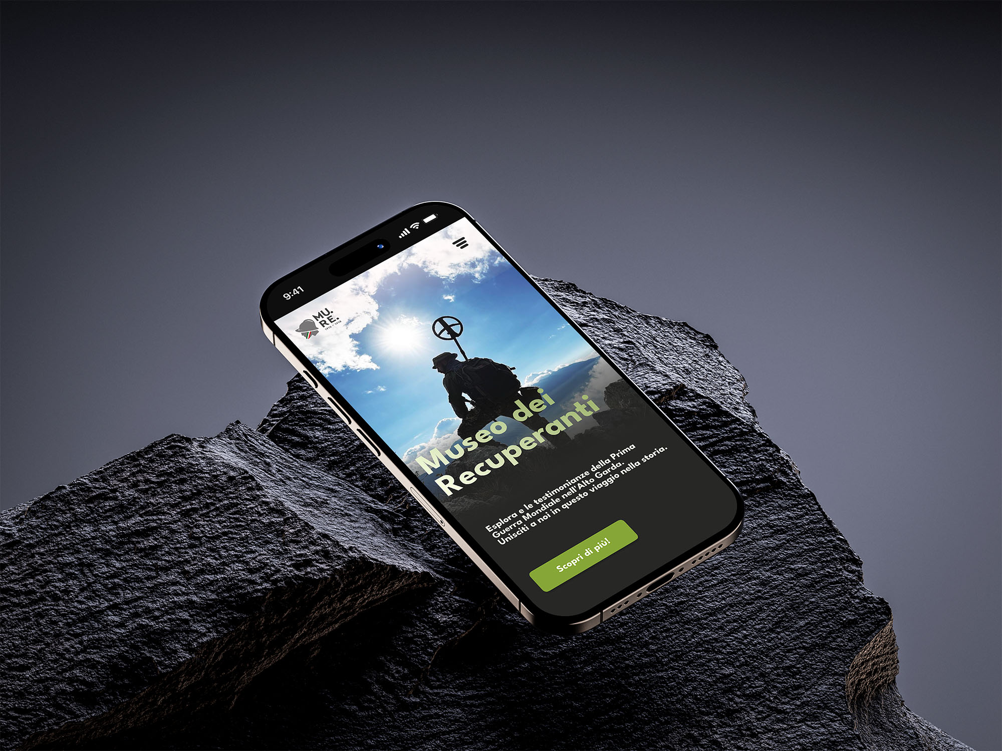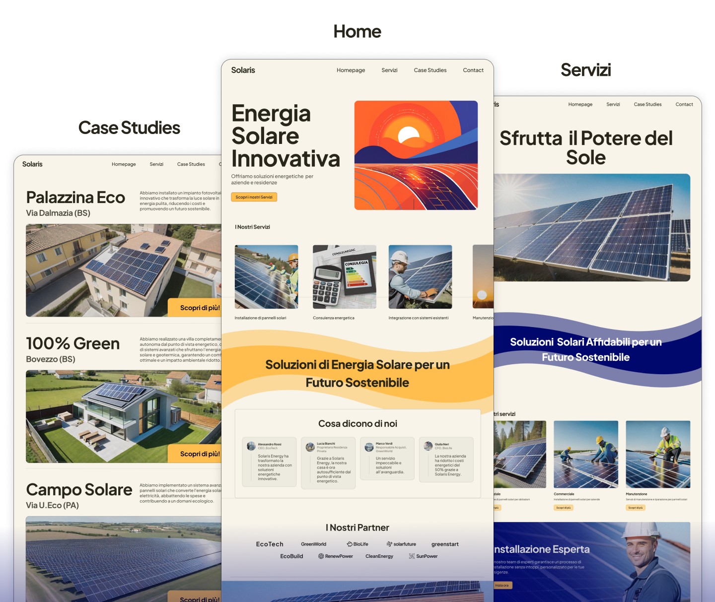


Solaris — Web Design Concept
Solaris Energy is a fictional brand I created as a web design and UX exercise, exploring how a solar energy company could communicate sustainability and technical credibility without falling into the visual clichés of the green energy sector — the overused leaf icons, the stock photo meadows, the corporate blues.
The Challenge
The self-imposed brief was specific: design a website that feels simultaneously warm and technical, approachable for residential customers and credible for business clients. Both audiences needed to feel addressed without the design compromising for either.
My Approach
The design process was entirely in Figma, producing static but detailed screens rather than a navigable prototype. Visual decisions centered on warm tonal accents against dark backgrounds — an unusual choice for the sector that helped Solaris feel distinct. Information architecture focused on separating the two audience types early in the navigation, reducing cognitive load for users who already knew which solution they were looking for. Case study sections within the design served as a way to explore how a company might build trust through real-world results rather than abstract claims.
What I'd do differently
A static Figma concept has limits — without prototyping the interactions and testing navigation flows with real users, some UX decisions remain assumptions. For a project focused on serving two distinct audiences, user testing would have been the logical next step.